Online Gallery of Contemporary Art
Delivered a full-cycle gallery website: analytics, architecture, design, development, and testing. A catalogue of 2,000+ works by over 100 artists with powerful search and filters.
 ART & BRUT Gallery

How do you help someone find the perfect piece among 2,000 works?
The gallery was growing into a significant operation. The old Wix-built site was unwieldy and hard to customise. It lacked mobile support, artist search, and filters by colour, size, or price.
The goal was to build a modern, fully functional platform where visitors could effortlessly find a piece that fits their space.
Analytics → Prototypes → Design → Development
Analytics & Research
We audited the existing site, analysed competitors, mapped user types and their needs, and built a functional map for the new site.
Prototyping
We started with sketches and moved to Balsamiq. Prototypes aligned stakeholders on details and served as the brief for the designer. We adopted a card-based layout as the foundation.
Design
The artworks are vivid — the site design needed to be restrained and unobtrusive. The gallery's minimalist brand identity aligned perfectly with this concept.
Development & Growth
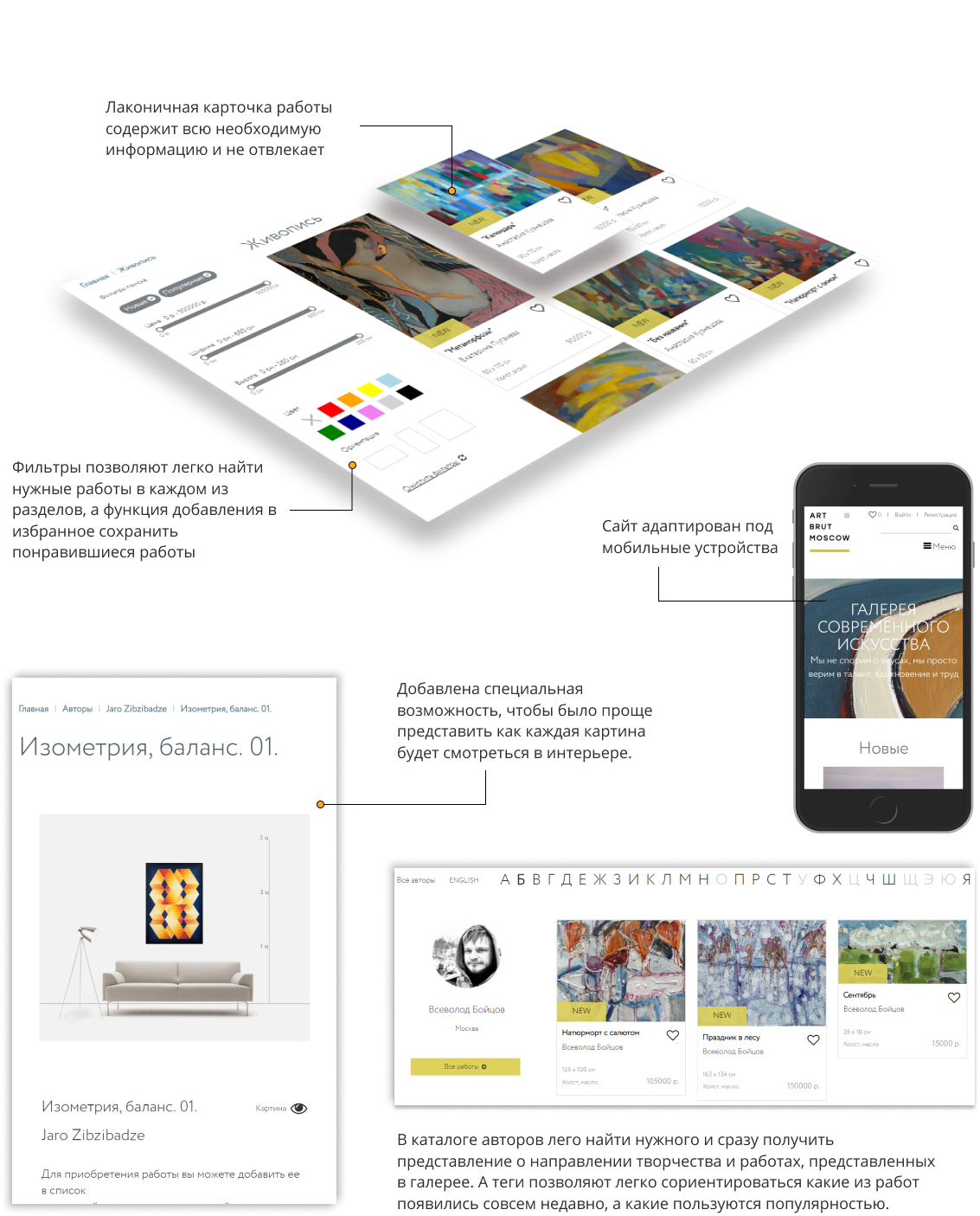
We built the site with a full catalogue, filters, favourites, and responsive design. The site continues to evolve: new sections, filters, and features are added regularly.
A catalogue that works for art lovers
Search & Filters
Filters by colour, size, price, artist, and style. Finding the right piece among thousands is effortless.
Favourites
Authentication and saved favourites. With 2,000+ works in the catalogue, keeping track of choices without this feature would be impractical.
Mobile Optimisation
Most visitors arrive from social media or events — on mobile. Responsive design was a top priority.
Room Visualisation
A dedicated feature to preview how each painting looks in an interior setting — a key conversion driver for buyers.
A gallery that keeps growing
The gallery site is in continuous development: new filters, sections, and capabilities are added regularly, and the admin toolset keeps expanding.
Need a catalogue site or advanced search?
We deliver full-cycle web development: from analytics and architecture to development and ongoing support. Tell us about your project.
Discuss your project